Bitcoin Security Part II: One Chart

[This post was first published on Medium].
I recently published a post (Bitcoin Security: a Negative Exponential) where I looked at the consequences of Bitcoin’s declining block rewards to the security of the network.
It became clear in the ensuing discussion that transaction fees were the favoured solution to this problem — as block rewards decline miner revenue will simply shift from mostly block rewards to mostly (then entirely) fees.
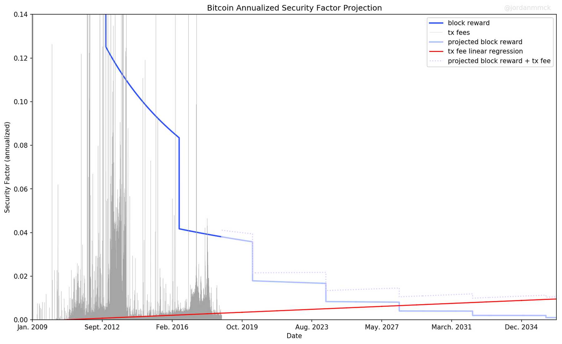
I wanted to find out what level of security we might expect in this scenario, so I created the plot shown below. The figure shows historic “security factor” levels over time, and extrapolates the data into the future.
I believe security factor to be the most important security metric, and so I think this chart gives the clearest single-image picture of Bitcoin security.

Hash Rate
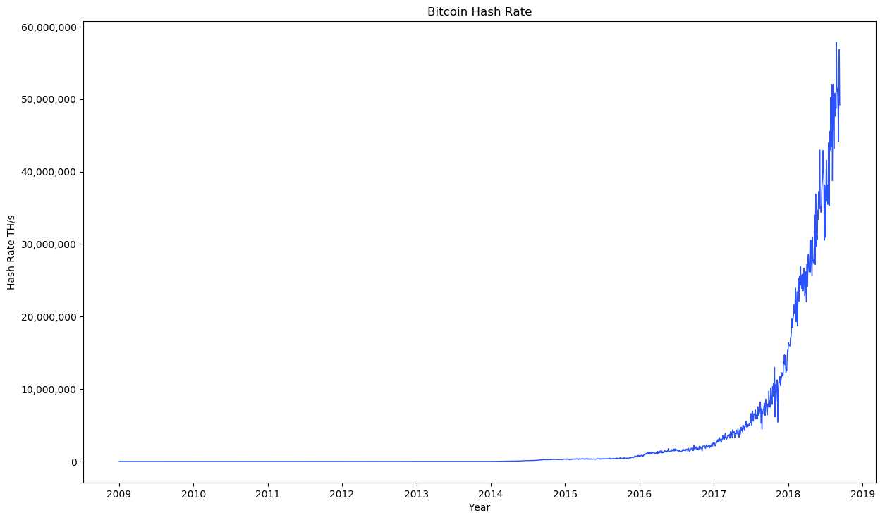
Doesn’t hash rate give the true picture of Bitcoin security over time?
Not really. Absolute hash rate is misleading. Increasing hash rate does not necessarily imply increasing security.
Imagine a network with a constant 100 TH/s of hash power year after year. Does the network have constant security? No. As long as mining hardware is improving the cost to acquire 100 TH/s declines every year — constant hash rate implies declining security.
If you want a constant level of security you need hash power to rise at the same rate that hardware advances. Only a hash rate that rises faster than hardware improvement truly implies increasing security.

Security Budget (SB)
So what best represents security if not absolute hash rate?
Proof-of-work provides security by making attacks expensive. Miners are spending a lot of money mining (and competing to produce maximum hash rate per dollar) so attackers will have to spend a lot to attack. So the total amount being spent ultimately determines the cost to attack.
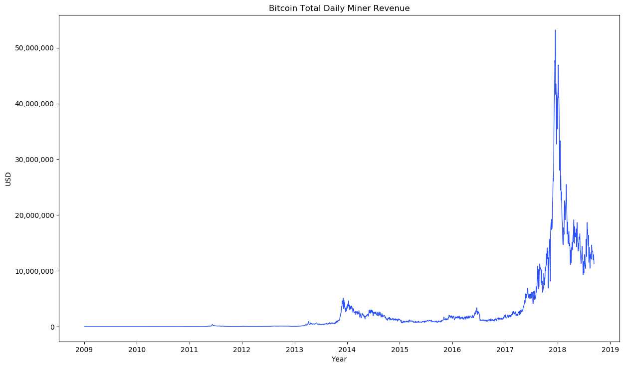
Since the total amount being spent by miners is capped by their revenue (they need to profit) the total miner revenue is really the thing that sets the security level. This is why I’ve been calling miner revenue the ”security budget” (SB).
Note: ASICs complicate the attack-cost profile, but they don’t materially change this relationship — the attack-cost equation is still dominated by the SB term Big(O) style (post coming soon™).

Security Factor (SF)
So then the best picture of security is total miner revenue?
I think there’s something better…
I’ve been arguing that the cost to attack a network (like Bitcoin) should scale with the value of the network — that networks must maintain some ”security factor” (SF is defined as attack_cost / network_value).
Imagine it cost $1M to kill a network worth $10M (10% SF). This is good. But if the network grew to $1B and the attack-cost remained $1M (SF way down to 0.1%), then this is bad — attack-cost should scale up with the network.
I believe SF is the key security metric. It gives a more informative view of network security than SB. Absolute attack-cost certainly matters, but without the context of network value it doesn’t really tell us whether the network is secure.
If all you know about a network is that it costs $1M to successfully attack it, can you say anything about the probability such an attack will happen? Not really.
(The exception to this is when attack-cost is extremely high. If attack-cost were $1T then we could be pretty confident an attack won’t happen regardless of network value.)
SF suggests something about the fundamental design of the system. If we see that some network has maintained a high SF over time despite price fluctuations, then it likely has well-designed security mechanisms.
We’re in the middle of a Cambrian explosion of cryptoeconomic “machines/organisms” trying to figure out which ones will survive. Systems with fundamentally robust security mechanisms are more fit.
We want to factor out exogenous stuff like price. Price is not intrinsic to the system, it is not an aspect of the machine — price is noise more than signal.
(In fact, fee revenue is not intrinsic to the system either! This is why I believe relying on the fee market for security is incredibly dangerous. I include it in the chart because it is the only other source of miner revenue, and will increasingly become the primary source…)
As shown below, SF does exactly this — it factors out price noise. We start with the SF definition, then since miner revenue (security budget) is the dominating determinant of attack-cost under PoW we substitute SB in for attack-cost, and price factors out:
SF = attack_cost / network_value
SF = SB / network_value
SF = SB / market_cap
SF = (block_rewards_usd + tx_fees_usd) / market_cap
SF = (block_rewards_btc * price + tx_fees_btc * price) / market_cap
SF = ((block_rewards_btc + tx_fees_btc) * price) / market_cap
SF = (((block_rewards_btc + tx_fees_btc) * price) / supply) * price
SF = (block_rewards_btc + tx_fees_btc) / supply
SF = block_rewards_btc / supply + tx_fees_btc / supply
SF = block_reward_security_factor + tx_fees_sec
When SF is defined as attack_cost / network_value we want it to be as high as possible. Under existing systems however high SF has a cost — it means a large percentage of total tokens are being shuffled over to miners/stakers to pay for security. So, as long as SF implies cost to users we want it to be as low as possible, but still well above dangerous levels.
Given that SF is such a fundamental security metric we really want to know how it is trending (and why). Downward trending SF is somewhat scary, though if we’re certain it won’t go below some safe level it might be OK…
The Chart
Finally we get to the chart.
The blue downward-stepping line is SF from block rewards. Where the line changes to light blue we’re projecting into the future (since we know the block reward schedule there is no speculation here).
The grey spiky data is SF from transaction fees. The red line was derived via linear regression on all existing fee data — it projects the fee-only SF into the future.
The dotted lavender line is simply the sum of the projected block reward SF and the projected fee-only SF.

So, current Bitcoin SF is ~4%, and based on the data we are heading for a low of ~1% sometime after 2030…
Is this bad? Is 1% good enough?
No one knows! All we know for sure is that previous SF levels of ~4% and higher have been adequate. Maybe 1% will be fine, maybe it won’t.
Can we really even be sure we’re heading for 1%?
Definitely not! Look at how erratic the fee-only SF levels have been. A linear regression points to ~1%, but maybe this is entirely the wrong extrapolation.
What the hell happens to fee-only SF when Lightning Network goes live?
?!?
This uncertainty is exactly why I think it’s so dangerous to rely on the fee-market for fundamental security. Nobody knows what the fee-market is going to do. It is external to the protocol, driven by user-side demand, and we can’t control it.
Note: the chart shows annualized SF numbers. So if total miner revenue for a given block was 15 BTC then annualized SF would be:
(15 * blocks_per_year) / supplyCode: all code used to generate the plots is available on GitHub. Data was up to date at the time of publishing. To generate an up-to-date chart at a later date just clone the repo and run the script. Everything should update automatically.
Thanks to @dinocelotti for feedback on this post!